miscellaneous
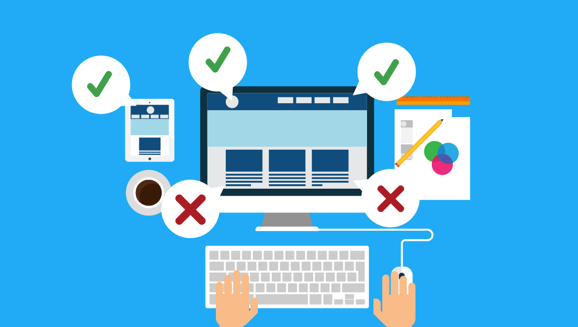
10 web design mistakes you should avoid at all costs
Nowadays you can’t think of starting something commercial without a website. A good website represents you and your goals to the others. Your website must be good at representing your views and providing information that people will want to know. Are you thinking about making a website? I have some things to say to you. There are some mistakes that will make your website ‘not good’ or you may use the word ‘irritating’. If you are a web designer you will not want to find about the errors about your website when it is live online. So, think about them right now. There are many mistakes you should abstain but I’m telling you about tens of them. By avoiding which you may create a far better website.
1. Search Box Complication:
You are providing information in your website. So, people will want to look for the information they want. For that ‘search’ box is a commonly used thing. Try to keep it very simple to search on your website. Make sure that people find no difficulty searching that search box at all. And of course never open a new window while clicking on the search box.
2. Unorganised Content Layout:
Content layout is so much important to let your visitor know exactly what you are providing. Some websites just put a paragraph and let people read it whole which users wouldn’t like at all. Use perfect headings and subheading so that people may find their necessary contents easily.
3. Navigation Complicity:
Navigation of a website is should be simple and straight. You can’t expect users to go for two or three pages to get what they what. People will lose the interest to browse your website. Put a navigation bar at the top of the site to keep it well visible. Direct users where to go from one page to another with a easy navigation bar.
4. Back Button Disappearing:
This is a worse experience a user can have while browsing. When a user clicks on a link it directs him to another direction that the user didn’t look for. Then he would want to go back but the ‘back’ button is disappeared which is utterly disgusting. I think that back button is one of the most used buttons while browsing a website. So never do that or that user may never come back to your site.
5. Opening New Window:
I think this the most irritating experience a user may have is opening a new window. You may find this in most of the torrent sites like KAT, YTS etc. Those sites are so popular that’s why people keep visiting their sites after having such experience. You are making a new website. So, don’t even think about it.
6. Not Having ‘Contact Us’ Button:
Assume that you are making a website for online shopping, you need to contact with customers. In this regard a contact us button on every page of your website will be very useful. That link will require name, address, phone number etc of a customer. People may also contact you if they find any difficulty browsing the website with that link.
7. Unfinished Links:
Links that directs to a page saying “404 not found” is far more annoying. Make sure that there is no links like that on your website. Check it and if found make it right quickly. You can tell one of your friends to take a look at your website from a user’s point of view. I think that’ll help you a lot.
8. Slow To Load:
If you are thinking about a professional website then you can never be excused for slow loading. A statistics shows that online shoppers wait for at most 4 seconds to respond on a website. Otherwise they just click away. So you just can’t afford to make people click away from your website. High definition pictures or addons may slow things down. Fix it before it’s too late.
9. Outdated Information:
Again’ it’s all about information that you are providing on your website. So you can’t afford to keep outdated information on your website. People will lose interest. You must update your information regularly and keep your website fresh. Your information must be accurate too to gain users’ credibility so check regularly and if find any error, fix it immediately.
10. Too Much Colorful:
You may use images to attract users but don’t make your website so much colorful. You are not making website for only children so keep it simple. Use two or three color maximum on every web page. You are providing information to your users so let them know your efficiency not artistic skill. Too much image and animation will make people click away. Try to keep a consistent look of your website.
Last of all, all I am saying is keep it simple. A simple looking website with exact and updated information, easy navigation, not having irritating materials may gain much popularity very quickly. People will love your website. All the great websites are simple and usable. So take a look at those, take preparation, think about the mistakes you should abstain and make something easy to use.


You must be logged in to post a comment Login