Check Plugin Documentation
Get started quickly with our comprehensive guides
About the plugin
The plugin has some handy features, including:
- Responsive layout;
- Multiple popup showing options (for desktop and for mobile):
- when user leaves the webpage area with his mouse (in this case, usually he want’s to click the close button) – for desktop only;
- when the page is fully loaded;
- 3 seconds after the popup is fully loaded;
- when the page is scrolled;
WordPress installation
Here is the link to the YOUTUBE VIDEO TUTORIAL.
Popup live demo HERE.
I also provided a Quick Install Guide for to feature an easy plugin installation for everyone.
First, you’ll need to install the plugin. The easiest method is to take the .zip file you’ve downloaded and upload it via Plugins > Add New > Upload Plugin in the WordPress Dashboard. Once the plugin is installed, be sure to Activate it.
Now that you’ve installed and activated the plugin, you’ll see a new menu item created inside WordPress called Get-Subscribers Popup Plugin. Before we start creating our first popup, though, let’s head over to Settings > Get-Subscribers Plugin and take a look at what options are available.
Plugin Settings
Refreshingly, Get-Subscribers Plugin has a super-simple settings screen. Let’s look at first at the Basic Settings panel:
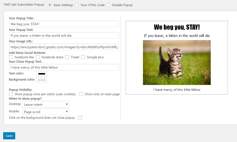
Here you can configure easily your first popup even if you have no HTML knowledge at all. There are options for:
- Your Popup Title: Choose the title of your popup. To disable it, leave this field blank.
- Your Popup Text: Choose the text of your popup. To disable it, leave this field blank.
- Your Image URL: Choose the image of your popup. Don’t forget! An image counts for 1000 words! To disable it, leave this field blank.
- Social Button Selection: Add Facebook Like, Facebook share, Twitter tweet or Google Plus +1 buttons to your popup. If you select to show Facebook Like button, an option will appear where you can specify if the like should go to the current page, or you can insert your own URL that will be liked.
- Your Close Popup Text: Choose the text of your popup close link. Clicking on this link will close the popup. To disable it, leave this field blank.
- Text Color: Color Picker for defining the color of your popup text.
- Background Color: Color Picker for defining the color of your popup background.
- Popup visibility – Show popup once per visitor (uses cookies): Checkbox to show popup only once for every new visitor on your site. After the user clears the cookies from his browser, the popup will show again.
- Popup visibility – Show only on main page: Checkbox to show popup only on the main page of your website.
- When to show popup: Dropdown for selecting the time when to show the popup on your web page.
- Click on the background does not close popup: Checkbox to control if clicking on popup background will close it or not.
Clicking the Save button will apply the popup on your webpage. Enjoy it!
Hint! A very useful feature is the Social Button Selection Box. This allows you to add to your site the 4 most popular social buttons with just the click of your mouse. The settings is found in the next image (highlighted by the black box):
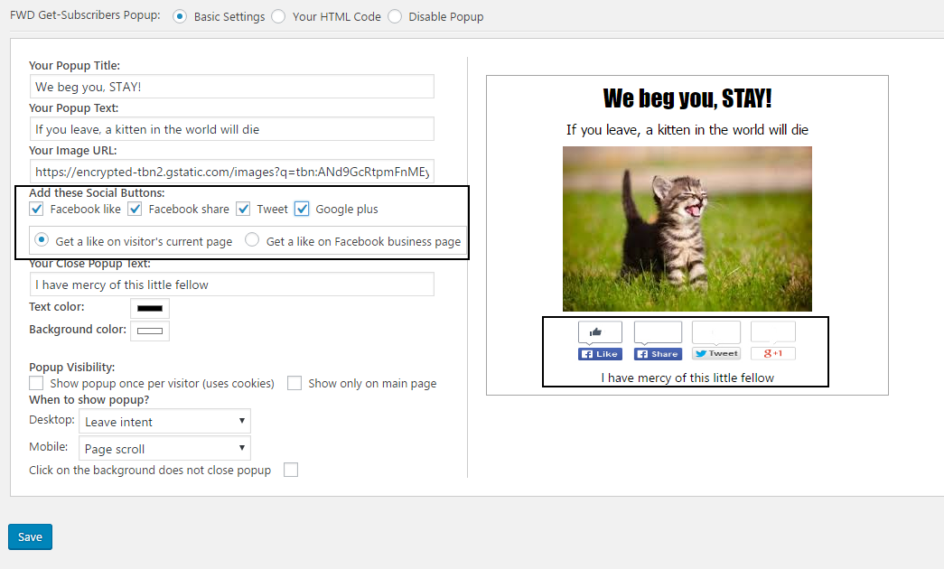
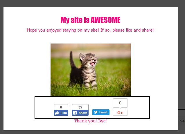
Live on your site, you will see the following result:
The second option at the top of the popup configuration field is Your HTML Code. Clicking on it will show the following configuration box:
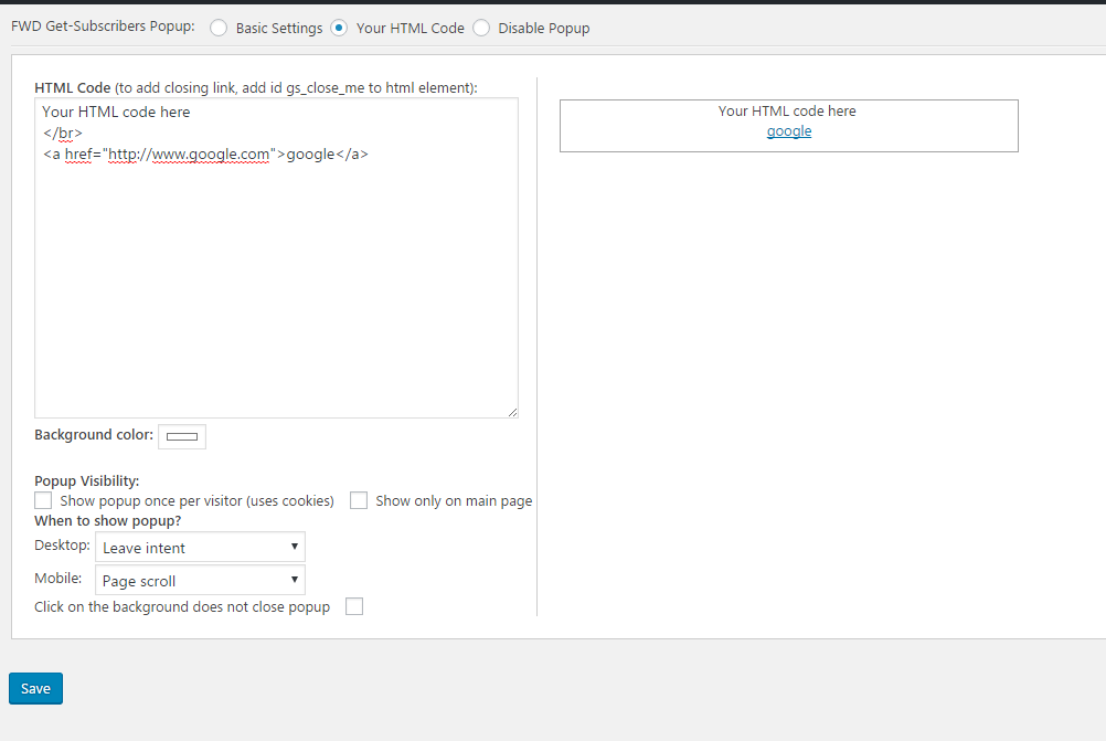
HTML Code: Here you can add your own HTML code. The preview window will show in real time the result of the parsing of the code you type. You can type any HTML you desire (including style blocks).
Hint! To add a a link to close the popup, simply add for any clickable element the custom id gs_close_me. Using the HTML Popup Configuration, your possibilities are infinite! Don’t forget to hit Save before leaving the configuration box!
I will help you in designing your first popup using HTML code!
1. To achieve something like in this example, copy and paste the following code to the ‘Your HTML Code’ textfield (don’t forget to modify the popup text for your needs):
        <style>
        .modal { display: block;
        position: fixed;
        z-index: 1;
        padding-top: 100px;
        left: 0;
        top: 0;
        width: 100%;
        height: 100%;
        overflow: auto;
        background-color: rgb(0,0,0);
        background-color: rgba(0,0,0,0.4);
        }.modal-content
        { position: relative;
        background-color: #fefefe;
        margin: auto;
        padding: 0;
        border: 1px solid #888;
        width: 80%;
        box-shadow: 0 4px 8px 0 rgba(0,0,0,0.2),0 6px 20px 0 rgba(0,0,0,0.19);
        -webkit-animation-name: animatetop;
        -webkit-animation-duration: 0.4s;
        animation-name: animatetop;
        animation-duration: 0.4s}
        @-webkit-keyframes animatetop { from {top:-300px; opacity:0} to {top:0; opacity:1}}
        @keyframes animatetop { from {top:-300px; opacity:0} to {top:0; opacity:1}}
        .close { color: white; float: right; font-size: 28px; font-weight: bold;}
        .close:hover,.close:focus { color: #000; text-decoration: none; cursor: pointer;}
        .modal-header { padding: 2px 16px; background-color: #5cb85c; color: white;}
        .modal-body {padding: 2px 16px;}
        .modal-footer { padding: 2px 16px; background-color: #5cb85c; color: white;}
        </style>
        <div id="myModal" class="modal">
        <div class="modal-content">
        <div class="modal-header">
        <span class="close">??</span>

        <h2>Modal Header</h2>

        </div> <div class="modal-body">

        <p>Some text in the Modal Body</p>
        <p>Some other text...</p>

        </div> <div class="modal-footer">

        <h3>Modal Footer</h3> </div> </div></div>

        <script>var modal = document.getElementById('myModal');
        var gsmodal = document.getElementById('gs_modal');
        var gsmodal2 = document.getElementById('gs_modal2');
        var span = document.getElementsByClassName("close")[0];
        modal.style.display = "block";span.onclick = function() { if(gsmodal!=null)gsmodal.style.display = "none";if(gsmodal2!=null)gsmodal2.style.display = "none";}
        </script>
2. To achieve something like in this example, copy and paste the following code to the ‘Your HTML Code’ textfield (NOTE THAT THIS EXAMPLE REQUIRES FURTHER MODIFICATIONS TO BE FULLY FUNCTIONAL!):
<div id="id01" class="w3-modal">
<div class="w3-modal-content w3-card-8 w3-animate-zoom"
style="max-width:600px"> <div class="w3-center">
<br> <span onclick="if(document.getElementById('gs_modal')!=null)document.getElementById('gs_modal').style.display='none';
if(document.getElementById('gs_modal2')!=null)document.getElementById('gs_modal2').style.display='none'" class="w3-closebtn w3-hover-red w3-container w3-padding-8 w3-display-topright" title="Close Modal">
×</span> <img src="https://s20.postimg.org/f8wi2j32l/img_avatar4_1.png" alt="Avatar" style="width:30%" class="w3-circle w3-margin-top">
 </div> <form class="w3-container"> <div class="w3-section"> <label><b>Username</b></label>
 <input class="w3-input w3-border w3-margin-bottom" type="text" placeholder="Enter Username" name="usrname" required>
 <label><b>Password</b></label> <input class="w3-input w3-border" type="password" placeholder="Enter Password" name="psw" required>
 <button class="w3-btn-block w3-green w3-section w3-padding" type="submit">Login</button>
 <input class="w3-check w3-margin-top" type="checkbox" checked="checked"> Remember me </div> </form>
 <div class="w3-container w3-border-top w3-padding-16 w3-light-grey">
 <button onclick="if(document.getElementById('gs_modal')!=null)document.getElementById('gs_modal').style.display='none';
 if(document.getElementById('gs_modal2')!=null)document.getElementById('gs_modal2').style.display='none'" type="button" class="w3-btn w3-red">
 Cancel</button> <span class="w3-right w3-padding w3-hide-small">Click on the top right 'X' to close the popup! Forgot <a href="#">password?
 </a></span> </div> </div> </div><script>document.getElementById('id01').style.display='block';</script>
3. To achieve something like in this example, copy and paste the following code to the ‘Your HTML Code’ textfield:
<style>
/* The Modal (background) */
.modal {
    display: none; /* Hidden by default */
    position: fixed; /* Stay in place */
    z-index: 1; /* Sit on top */
    padding-top: 100px; /* Location of the box */
    left: 0;
    top: 0;
    width: 100%; /* Full width */
    height: 100%; /* Full height */
    overflow: auto; /* Enable scroll if needed */
    background-color: rgb(0,0,0); /* Fallback color */
    background-color: rgba(0,0,0,0.4); /* Black w/ opacity */
}

/* Modal Content */
.modal-content {
    position: relative;
    background-color: #fefefe;
    margin: auto;
    padding: 0;
    border: 1px solid #888;
    width: 80%;
    box-shadow: 0 4px 8px 0 rgba(0,0,0,0.2),0 6px 20px 0 rgba(0,0,0,0.19);
    -webkit-animation-name: animatetop;
    -webkit-animation-duration: 0.4s;
    animation-name: animatetop;
    animation-duration: 0.4s
}

/* Add Animation */
@-webkit-keyframes animatetop {
    from {top:-300px; opacity:0}
    to {top:0; opacity:1}
}

@keyframes animatetop {
    from {top:-300px; opacity:0}
    to {top:0; opacity:1}
}

/* The Close Button */
.close {
    color: white;
    float: right;
    font-size: 28px;
    font-weight: bold;
}

.close:hover,
.close:focus {
    color: #000;
    text-decoration: none;
    cursor: pointer;
}

.modal-header {
    padding: 2px 16px;
    background-color: #CD2A3E;
    color: white;
}

.modal-body {padding: 2px 16px;}

.modal-footer {
    padding: 2px 16px;
    background-color: #436F4D;
    color: white;
}
</style>
<div id="myModal" class="modal">

  <!-- Modal content -->
  <div class="modal-content">
    <div class="modal-header">
      <span class="close">??</span>
      <h2>This is the Hungarian Flag!</h2>
    </div>
    <div class="modal-body">
      <p>This is an example of the Get-Subscribers Exit Popup Plugin for WordPress!</p>
      <p>You can see more detains <a href="https://codecanyon.net/item/get-subscribers-popup-for-wordpress/18190162" target="_blank">here</a></p>
    </div>
    <div class="modal-footer">
      <h3>PS: I am also responsive! Have a nice day! ☺</h3>
    </div>
  </div>

</div>
<script>
var span = document.getElementsByClassName("close")[0];
var modal = document.getElementById('myModal');
var modal1 = document.getElementById('gs_modal');
var modal2 = document.getElementById('gs_modal2');
// When the user clicks on  (x), close the modal
span.onclick = function() {
    if(modal2 != null)
        modal2.style.display = "none";
    if(modal1 != null)
        modal1.style.display = "none";
}

modal.style.display = "block";
</script>
4. To achieve something like in this example, copy and paste the following code to the ‘Your HTML Code’ textfield:
<style>
body { margin: 0; }
#shade, #modal { display: none; }
#shade { position: fixed; z-index: 100; top: 0; left: 0; width: 100%; height: 100%; }
#modal { position: fixed; z-index: 101; top: 33%; left: 25%; width: 50%; }
#shade { background: silver; opacity: 0.5; filter: alpha(opacity=50); }
</style>
<div id="myModal" class="w3-modal w3-black">
 <span class="w3-text-white w3-xxlarge w3-hover-text-grey w3-container w3-display-topright" onclick="closeModal()" style="cursor:pointer">×</span>
 <div class="w3-modal-content">

  <div class="w3-content" style="max-width:1200px">
   <img class="mySlides" src="https://s20.postimg.org/62e7f8xu5/img_fjords_wide.jpg" style="width:100%">
   <img class="mySlides" src="https://s20.postimg.org/uwxp9biod/img_mountains_wide.jpg" style="width:100%">
   <img class="mySlides" src="https://s20.postimg.org/s44hpaibx/img_nature_wide.jpg" style="width:100%">
   <div class="w3-row w3-black w3-center">
    <div class="w3-container w3-display-container">
     <p id="caption"></p>
     <span class="w3-display-left w3-btn-floating" onclick="plusDivs(-1)">❮</span>
     <span class="w3-display-right w3-btn-floating" onclick="plusDivs(1)">❯</span>
    </div>
    <div class="w3-col s4">
     <img class="demo w3-opacity w3-hover-opacity-off" src="https://s20.postimg.org/62e7f8xu5/img_fjords_wide.jpg" style="width:100%" onclick="currentDiv(1)" alt="Nature and sunrise">
    </div>
    <div class="w3-col s4">
     <img class="demo w3-opacity w3-hover-opacity-off" src="https://s20.postimg.org/uwxp9biod/img_mountains_wide.jpg" style="width:100%" onclick="currentDiv(2)" alt="Trolltunga, Norway">
    </div>
    <div class="w3-col s4">
     <img class="demo w3-opacity w3-hover-opacity-off" src="https://s20.postimg.org/s44hpaibx/img_nature_wide.jpg" style="width:100%" onclick="currentDiv(3)" alt="Mountains and fjords">
    </div>
   </div> <!-- End row -->
  </div> <!-- End w3-content -->

 </div> <!-- End modal content -->
</div>
<script type="text/javascript">
            var modal= document.getElementById('modal');
            var shade= document.getElementById('shade');
            document.getElementById('start').onclick= function() {
                modal.style.display=shade.style.display= 'block';
                var but= document.getElementById('start');
                but.style.display= 'none';
            };
            document.getElementById('close').onclick= function() {
            var gsmodal= document.getElementById('gs_modal');
                gsmodal.style.display=shade.style.display= 'none';
            };
            if (!('maxHeight' in document.body.style)) {
                function modalsize() {
                    var top= document.documentElement.scrollTop;
                    var winsize= document.documentElement.offsetHeight;
                    var docsize= document.documentElement.scrollHeight;
                    shade.style.height= Math.max(winsize, docsize)+'px';
                    modal.style.top= top+Math.floor(winsize/3)+'px';
                };
                modal.style.position=shade.style.position= 'absolute';
                window.onscroll=window.onresize= modalsize;
                modalsize();
            }
        </script>
<script>
function openModal() {
  document.getElementById('myModal').style.display = "block";
}

function closeModal() {
  document.getElementById('gs_modal').style.display = "none";
}

var slideIndex = 1;
showDivs(slideIndex);

function plusDivs(n) {
  showDivs(slideIndex += n);
}

function currentDiv(n) {
  showDivs(slideIndex = n);
}

function showDivs(n) {
  var i;
  var x = document.getElementsByClassName("mySlides");
  var dots = document.getElementsByClassName("demo");
  var captionText = document.getElementById("caption");
  if (n > x.length) {slideIndex = 1}
  if (n < 1) {slideIndex = x.length}
  for (i = 0; i < x.length; i++) {
     x[i].style.display = "none";
  }
  for (i = 0; i < dots.length; i++) {
     dots[i].className = dots[i].className.replace(" w3-opacity-off", "");

  }
  x[slideIndex-1].style.display = "block";
  dots[slideIndex-1].className += " w3-opacity-off";
  captionText.innerHTML = dots[slideIndex-1].alt;
}
openModal();
currentDiv(1);
</script>
The third option at the top of the popup configuration field is Disable Popup. Clicking on it will disable the popup until you enable it once again and reconfigure it.
Get Subscribers Popup is a simple, yet powerful tool you can use to create a serious followers base for your business, product or item. The setup and settings of the plugin couldn’t have been easier. Now, let’s go and create some popups! Have fun using it!
Sources and Credits
This component was made by Szabi Kisded, for more information and support contact us at support@coderevolution.ro
Once again, thank you so much for purchasing this item. As I said at the beginning, I’d be glad to help you if you have any questions regarding this plugin and I’ll do my best to assist.
Kisded