Check Plugin Documentation
Get started quickly with our comprehensive guides
How fast can the COVID-19 Coronavirus spread?
Learn how the COVID-19 Coronavirus (Wuhan China Outbreak or Pandemic) can spread rapidly with this Coronavirus Spreading Prediction Tool. Test your own scenarios or use real live data from CDC / WHO to update your own personal website that will contain a personalized Coronavirus Prediction Tool!
COVID-19 Coronavirus – Viral Pandemic Prediction Tools WordPress Plugin is a powerful tool to inform your website’s visitors about the impact of a global pandemic, which might be caused by the COVID-19 Coronavirus.
– You can embed tables and charts with the prediction of the evolution of the spreading of a global or regional pandemic.
– It can also use iframes to automatically embed dashboards from WHO and Johns Hopkins, to track in real time the progress of the outbreak.
The goal is to achieve the following:
COVID-19 Coronavirus – Viral Pandemic Prediction Tools will automatically create prediction tables and charts
Predict possible outcomes for the a possible pandemic
Predict the spread of the COVID-19 Coronavirus outbreak (formerly Wuhan China Virus 2019-nCoV) with this plugin. It was built to allow you to enter our own parameters and automatically estimate and predict the speed and magnitude of the Novel Coronavirus spreading
Allow your visitors to experiment with data and results
Allow your website’s users to create their own scenarios and watch charts and prediction tables about how the pandemic will unfold, based on the parameters they entered
Many parameters to change
You can change a multitude of parameters that will influence the speed and magnitude of the spreading of the disease. Parameters include: starting population, start date, initial infected count, unkillable elite in bunkers, infection rate, incubation period, mortality rate, mortality complicator, disease burnout rate
Embed Official Dashboards to track the outbreak in real time
The plugin also allows the direct embedding of official dashboards that follow and report the current situation on the Coronavirus outbreak, directly to your web site.
Supported dashboards:
– Johns Hopkins CSSE dashboard
– WHO dashboard
Interactive charts for details
The plugin will generate beautiful and interactive charts and tables that will present the evolution of the disease, based on the parameters you enter in it’s settings
Gutenberg blocks and shortcodes
The plugin provides Gutenberg blocks, shortcodes and TinyMCE buttons for easy embedding of the content it generates. All you have to do is push a button, configure some parameters and you will get the results on your site automatically
Design your charts
The plugin will allow you to design the appearance of the charts and tables you add to your page.
Simply change some parameters from the Gutenberg blocks or shortcodes and the charts will be customized to fit the design of your site
Sample data for use
The plugin will provide some sample data you can use to test the features provided by the charts and tables.
Sample historical data is provided for: the Common Flu, SARS, MERS, Spanish Flu and COVID-19
WordPress installation
YouTube video tutorial:
I also provided a Quick Install Guide to feature an easy plugin installation for everyone.
To make this plugin work, first, you’ll need to install the plugin. The easiest method is to take the .zip file you’ve downloaded and upload it via Plugins > Add New > Upload Plugin in the WordPress Dashboard. Once the plugin is installed, be sure to Activate it.
Now that you’ve installed and activated the plugin, you’ll see a new menu item created inside WordPress called ‘COVID-19 Coronavirus – Viral Pandemic Prediction Tools’. First thing first, let’s head over to Settings > COVID-19 Coronavirus – Viral Pandemic Prediction Tools and take a look at what options are available.
Plugin Settings
Refreshingly, COVID-19 Coronavirus – Viral Pandemic Prediction Tools has a super-simple settings screen. Let’s look at first at the settings panel:
Main Settings:
- Viral Pandemic Prediction Tools – Main Switch: Enable or disable this plugin. This acts like a main switch.
Here you can find the steps needed in configuring your plugin even if you have no HTML knowledge at all.
HINT! Don’t forget to click the Save button every time you modified your settings, otherwise the modifications will be lost!
Available shortcode (also with Gutenberg block alternatives):
-
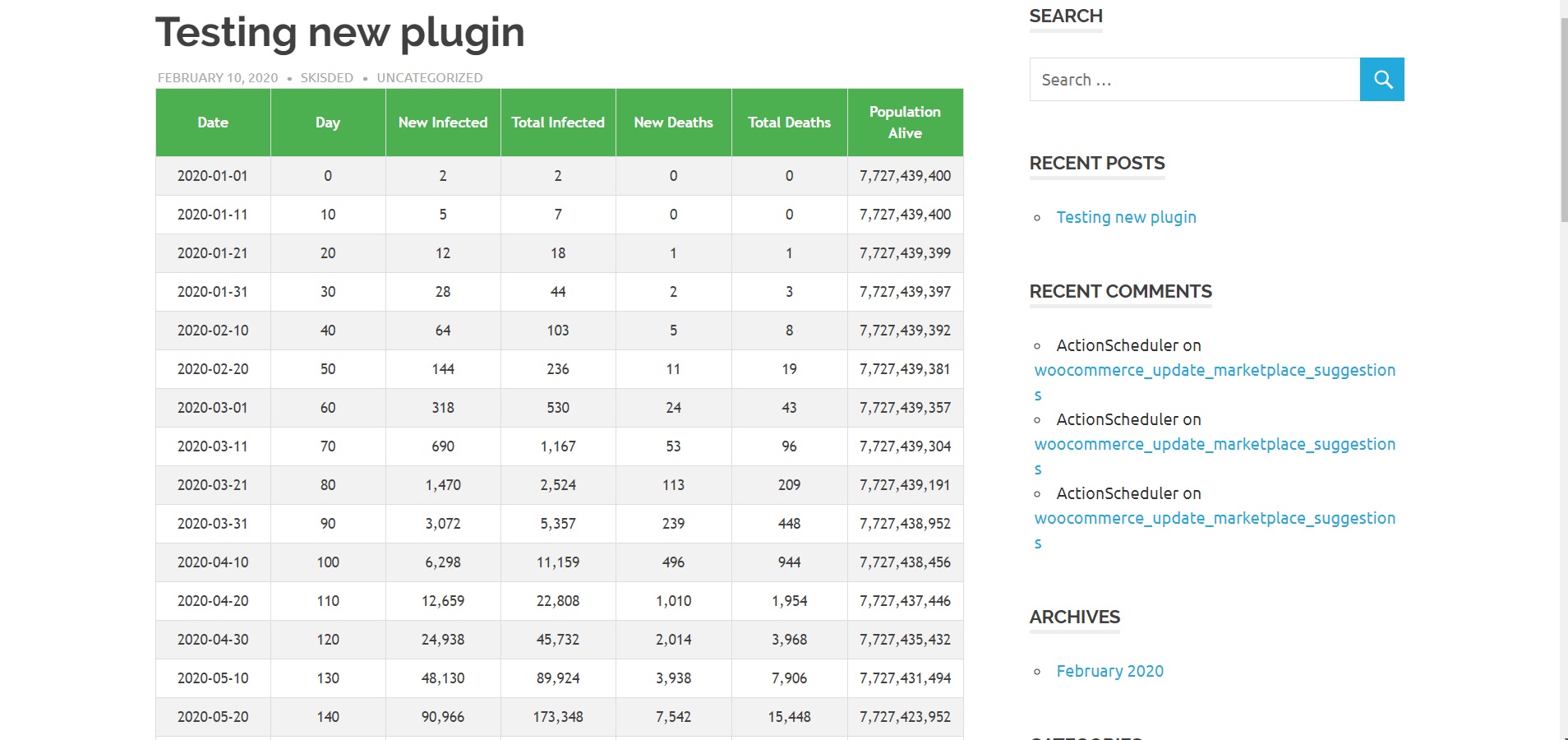
[coronavirus-spread-prediction-table]
Used to display a table of estimated spreading of a viral pandemic. You can use the following shortcode parameters:
- ‘starting_population’ => The population to start the ecuation with. Default:’7727439400′
- ‘unkillable_elite_in_bunkers’ => The population that will not die. Default:’50000′
- ‘start_date’ => The date when the pandemic starts. Default:’01-01-2020′
- ‘initial_infections’ => The count of the initially infected people. Default:’2′
- ‘infection_rate’ => The rate of infection – how many newly infected people each infected will generate. Default:’2.45′
- ‘incubation_days’ => The incubation period of the disease (in days). Default:’10’
- ‘mortality_rate’ => The mortality rate of the disease (in percentage). Default:’3′
- ‘mortality_complicator’ => The mortality complicator of the disease (in percentage). This kicks in when many new infected are being generated in a short period of time (no more free space in hospitals). Default:’10’
- ‘burnout_rate’ => The rate after which the disease will be stopped (cured or self contained) – (in percentage). Default:’4′
- ‘iteration_count’ => The number of iterations to display. Default:’50’
- ‘date_format’ => The format of the date. Default:’Y-m-d’
- ‘header_texts’ => A comma separated list of header texts for the table. Default:’Date,Day,New Infected,Total Infected,New Deaths,Total Deaths’
- ‘thousands_sep’ => The ‘thousand’ separator for numbers. Default:’,’
-
[coronavirus-new-infected-death-chart]
Used to display a chart to display and compare values for estimated new infected cases and new deaths for a time period, of a viral pandemic. You can use the following shortcode parameters:
- ‘starting_population’ => The population to start the ecuation with. Default:’7727439400′
- ‘unkillable_elite_in_bunkers’ => The population that will not die. Default:’50000′
- ‘start_date’ => The date when the pandemic starts. Default:’01-01-2020′
- ‘initial_infections’ => The count of the initially infected people. Default:’2′
- ‘infection_rate’ => The rate of infection – how many newly infected people each infected will generate. Default:’2.45′
- ‘incubation_days’ => The incubation period of the disease (in days). Default:’10’
- ‘mortality_rate’ => The mortality rate of the disease (in percentage). Default:’3′
- ‘mortality_complicator’ => The mortality complicator of the disease (in percentage). This kicks in when many new infected are being generated in a short period of time (no more free space in hospitals). Default:’10’
- ‘burnout_rate’ => The rate after which the disease will be stopped (cured or self contained) – (in percentage). Default:’4′
- ‘iteration_count’ => The number of iterations to display. Default:’50’
- ‘date_format’ => The format of the date. Default:’Y-m-d’
- ‘align’ => The alignment of the graph. Default:’alignright’
- ‘margin’ => The margin size of the graph. Default:’5px 20px’
- ‘datalabels’ => A comma separated list of labels for the top of the graph. Default:’New Infected, New Deaths’
- ‘canvaswidth’ => The width of the canvas of the graph. Default:’625′
- ‘canvasheight’ => The height of the canvas of the graph. Default:’625′
- ‘width’ => The width of the graph. Default:’100%’
- ‘height’ => The height of the graph. Default:’auto’
- ‘relativewidth’ => Enable relative width. Default:’1′
- ‘classn’ => Additional class for the graph. Default:”
- ‘colors’ => A comma separated list of colors for graph elements. Default:’#69D2E7,#a0a48C,#F38630,#96CE7F,#CEBC17,#CE4264′
- ‘fillopacity’ => The opacity of the color filling of graph elements. Default:’0.7′
- ‘animation’ => Enable animations for the graph. Default:’true’
- ‘scalefontsize’ => The size of the fonts, scaled. Default:’12’
- ‘scalefontcolor’ => The color of the fonts. Default:’#666′
- ‘scaleoverride’ => The override for fonts. Default:’false’
- ‘scalesteps’ => The steps for fonts (advanced). Default:’null’
- ‘scalestepwidth’ => The step width for fonts (advanced). Default:’null’
- ‘scalestartvalue’ => The step start value for fonts (advanced). Default:’null’
-
[coronavirus-total-infected-death-chart]
Used to display a chart to display and compare values for estimated total infected cases and total deaths for a time period, of a viral pandemic. You can use the following shortcode parameters:
- ‘starting_population’ => The population to start the ecuation with. Default:’7727439400′
- ‘unkillable_elite_in_bunkers’ => The population that will not die. Default:’50000′
- ‘start_date’ => The date when the pandemic starts. Default:’01-01-2020′
- ‘initial_infections’ => The count of the initially infected people. Default:’2′
- ‘infection_rate’ => The rate of infection – how many newly infected people each infected will generate. Default:’2.45′
- ‘incubation_days’ => The incubation period of the disease (in days). Default:’10’
- ‘mortality_rate’ => The mortality rate of the disease (in percentage). Default:’3′
- ‘mortality_complicator’ => The mortality complicator of the disease (in percentage). This kicks in when many new infected are being generated in a short period of time (no more free space in hospitals). Default:’10’
- ‘burnout_rate’ => The rate after which the disease will be stopped (cured or self contained) – (in percentage). Default:’4′
- ‘iteration_count’ => The number of iterations to display. Default:’50’
- ‘date_format’ => The format of the date. Default:’Y-m-d’
- ‘align’ => The alignment of the graph. Default:’alignright’
- ‘margin’ => The margin size of the graph. Default:’5px 20px’
- ‘datalabels’ => A comma separated list of labels for the top of the graph. Default:’Total Infected, Total Deaths’
- ‘canvaswidth’ => The width of the canvas of the graph. Default:’625′
- ‘canvasheight’ => The height of the canvas of the graph. Default:’625′
- ‘width’ => The width of the graph. Default:’100%’
- ‘height’ => The height of the graph. Default:’auto’
- ‘relativewidth’ => Enable relative width. Default:’1′
- ‘classn’ => Additional class for the graph. Default:”
- ‘colors’ => A comma separated list of colors for graph elements. Default:’#69D2E7,#a0a48C,#F38630,#96CE7F,#CEBC17,#CE4264′
- ‘fillopacity’ => The opacity of the color filling of graph elements. Default:’0.7′
- ‘animation’ => Enable animations for the graph. Default:’true’
- ‘scalefontsize’ => The size of the fonts, scaled. Default:’12’
- ‘scalefontcolor’ => The color of the fonts. Default:’#666′
- ‘scaleoverride’ => The override for fonts. Default:’false’
- ‘scalesteps’ => The steps for fonts (advanced). Default:’null’
- ‘scalestepwidth’ => The step width for fonts (advanced). Default:’null’
- ‘scalestartvalue’ => The step start value for fonts (advanced). Default:’null’
-
[coronavirus-population-decline-chart]
Used to display a chart to display the amount of population decline, for a time period, in case of a viral pandemic. You can use the following shortcode parameters:
- ‘starting_population’ => The population to start the ecuation with. Default:’7727439400′
- ‘unkillable_elite_in_bunkers’ => The population that will not die. Default:’50000′
- ‘start_date’ => The date when the pandemic starts. Default:’01-01-2020′
- ‘initial_infections’ => The count of the initially infected people. Default:’2′
- ‘infection_rate’ => The rate of infection – how many newly infected people each infected will generate. Default:’2.45′
- ‘incubation_days’ => The incubation period of the disease (in days). Default:’10’
- ‘mortality_rate’ => The mortality rate of the disease (in percentage). Default:’3′
- ‘mortality_complicator’ => The mortality complicator of the disease (in percentage). This kicks in when many new infected are being generated in a short period of time (no more free space in hospitals). Default:’10’
- ‘burnout_rate’ => The rate after which the disease will be stopped (cured or self contained) – (in percentage). Default:’4′
- ‘iteration_count’ => The number of iterations to display. Default:’50’
- ‘date_format’ => The format of the date. Default:’Y-m-d’
- ‘align’ => The alignment of the graph. Default:’alignright’
- ‘margin’ => The margin size of the graph. Default:’5px 20px’
- ‘datalabels’ => A comma separated list of labels for the top of the graph. Default:’Population Decline’
- ‘canvaswidth’ => The width of the canvas of the graph. Default:’625′
- ‘canvasheight’ => The height of the canvas of the graph. Default:’625′
- ‘width’ => The width of the graph. Default:’100%’
- ‘height’ => The height of the graph. Default:’auto’
- ‘relativewidth’ => Enable relative width. Default:’1′
- ‘classn’ => Additional class for the graph. Default:”
- ‘colors’ => A comma separated list of colors for graph elements. Default:’#69D2E7,#a0a48C,#F38630,#96CE7F,#CEBC17,#CE4264′
- ‘fillopacity’ => The opacity of the color filling of graph elements. Default:’0.7′
- ‘animation’ => Enable animations for the graph. Default:’true’
- ‘scalefontsize’ => The size of the fonts, scaled. Default:’12’
- ‘scalefontcolor’ => The color of the fonts. Default:’#666′
- ‘scaleoverride’ => The override for fonts. Default:’false’
- ‘scalesteps’ => The steps for fonts (advanced). Default:’null’
- ‘scalestepwidth’ => The step width for fonts (advanced). Default:’null’
- ‘scalestartvalue’ => The step start value for fonts (advanced). Default:’null’
-
[coronavirus-total-deaths-chart]
Used to display a chart to display the amount of total deaths count, for a time period, in case of a viral pandemic. You can use the following shortcode parameters:
- ‘starting_population’ => The population to start the ecuation with. Default:’7727439400′
- ‘unkillable_elite_in_bunkers’ => The population that will not die. Default:’50000′
- ‘start_date’ => The date when the pandemic starts. Default:’01-01-2020′
- ‘initial_infections’ => The count of the initially infected people. Default:’2′
- ‘infection_rate’ => The rate of infection – how many newly infected people each infected will generate. Default:’2.45′
- ‘incubation_days’ => The incubation period of the disease (in days). Default:’10’
- ‘mortality_rate’ => The mortality rate of the disease (in percentage). Default:’3′
- ‘mortality_complicator’ => The mortality complicator of the disease (in percentage). This kicks in when many new infected are being generated in a short period of time (no more free space in hospitals). Default:’10’
- ‘burnout_rate’ => The rate after which the disease will be stopped (cured or self contained) – (in percentage). Default:’4′
- ‘iteration_count’ => The number of iterations to display. Default:’50’
- ‘date_format’ => The format of the date. Default:’Y-m-d’
- ‘align’ => The alignment of the graph. Default:’alignright’
- ‘margin’ => The margin size of the graph. Default:’5px 20px’
- ‘datalabels’ => A comma separated list of labels for the top of the graph. Default:’Total Deaths’
- ‘canvaswidth’ => The width of the canvas of the graph. Default:’625′
- ‘canvasheight’ => The height of the canvas of the graph. Default:’625′
- ‘width’ => The width of the graph. Default:’100%’
- ‘height’ => The height of the graph. Default:’auto’
- ‘relativewidth’ => Enable relative width. Default:’1′
- ‘classn’ => Additional class for the graph. Default:”
- ‘colors’ => A comma separated list of colors for graph elements. Default:’#69D2E7,#a0a48C,#F38630,#96CE7F,#CEBC17,#CE4264′
- ‘fillopacity’ => The opacity of the color filling of graph elements. Default:’0.7′
- ‘animation’ => Enable animations for the graph. Default:’true’
- ‘scalefontsize’ => The size of the fonts, scaled. Default:’12’
- ‘scalefontcolor’ => The color of the fonts. Default:’#666′
- ‘scaleoverride’ => The override for fonts. Default:’false’
- ‘scalesteps’ => The steps for fonts (advanced). Default:’null’
- ‘scalestepwidth’ => The step width for fonts (advanced). Default:’null’
- ‘scalestartvalue’ => The step start value for fonts (advanced). Default:’null’
-
[coronavirus-jh-dashboard]
Used to display an embed of the official Johns Hopkins CSSE Dashboard. You can use the following shortcode parameters:
- ‘height_px’ => The height of the embed. Default:’800px’
-
[coronavirus-who-dashboard]
Used to display an embed of the official WHO Dashboard. You can use the following shortcode parameters:
- ‘height_px’ => The height of the embed. Default:’800px’
-
[coronavirus-user-input]
Used to add a form using which users can test the features of the plugin and simulate graphs and charts with their own starting data. You can use the following shortcode parameters:
- ‘show_table’ => Do you wan to show the main table? Default:’true’
- ‘show_new_infected_death_graph’ => Do you wan to show the new infected and death chart? Default:’true’
- ‘show_population_decline_graph’ => Do you wan to show the population decline chart? Default:’true’
- ‘show_total_deaths_graph’ => Do you wan to show the total deaths graph? Default:’true’
- ‘show_total_deaths_infected_graph’ => Do you wan to show the total infected and deaths chart? Default:’true’
Sample Data For Example Diseases:
| Common Flu | SARS | MERS | Spanish Flu | COVID-19 (Wuhan Coronavirus) | |
|---|---|---|---|---|---|
| Infection Rate (R0) | 1.28 | 2.60 | 0.70 | 1.40-2.80 | 2.50-4.00 ? |
| Mortality Rate | 0.10% | 11% | 35% | 10-20% | 2-5% ? |
| Mortality Complicator | <1% | ~15% | ~15% | ~20% | >20% ? |
| Incubation Period | 1-2 days | 4-6 days | 1-21 days | 2-7 days | 2-24 days ? |
| Vaccination And Curability | 10%-48% effective | No cure available | No cure available | No cure available | No cure available ? |
Summary
COVID-19 Coronavirus – Viral Pandemic Prediction Tools is a simple, yet powerful tool you can use to predict the outcome of a pandemic that might occcur now or in the future. The setup and settings of the plugin couldn’t have been easier. Now, let’s go and enjoy the results of this great plugin! Have fun using it!
Sources and Credits
This component was made by Szabi CodeRevolution, for more information and support contact us at support@coderevolution.ro
Once again, thank you so much for purchasing this item. As I said at the beginning, I’d be glad to help you if you have any questions regarding this plugin and I’ll do my best to assist.
CodeRevolution